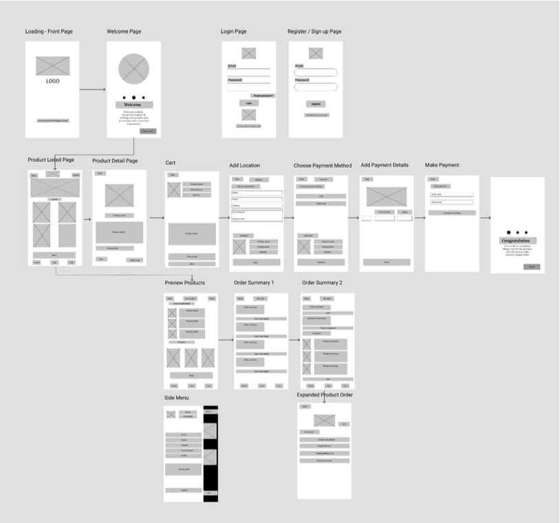
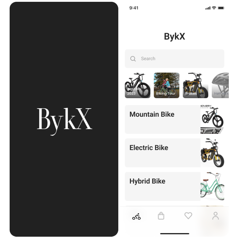
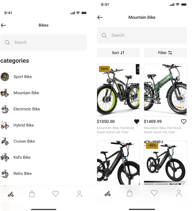
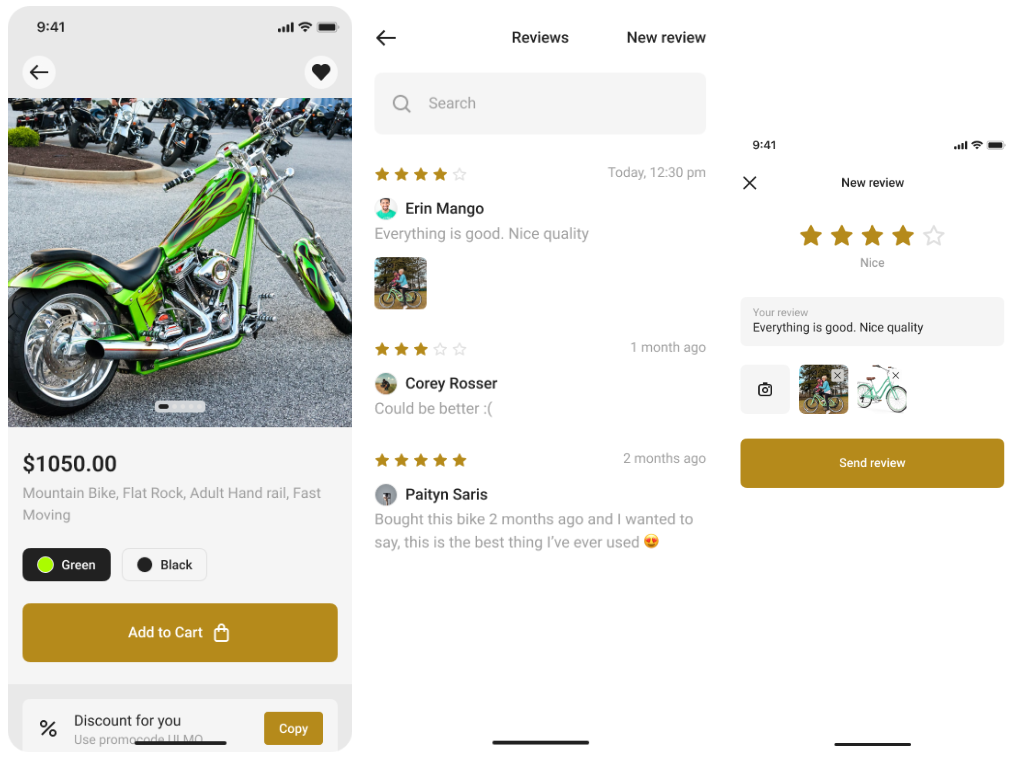
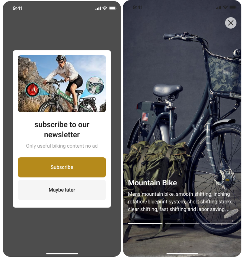
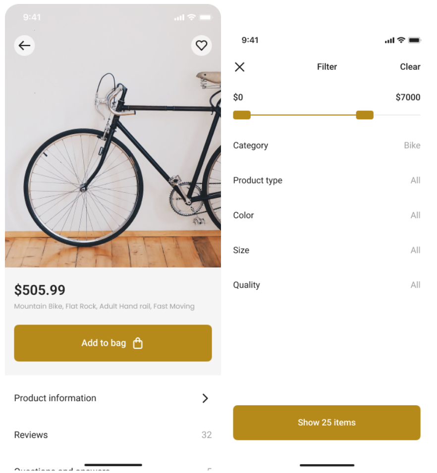
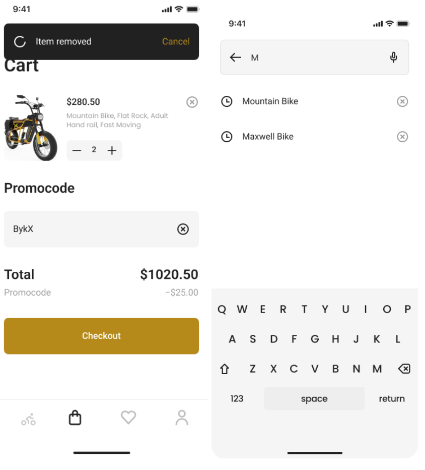
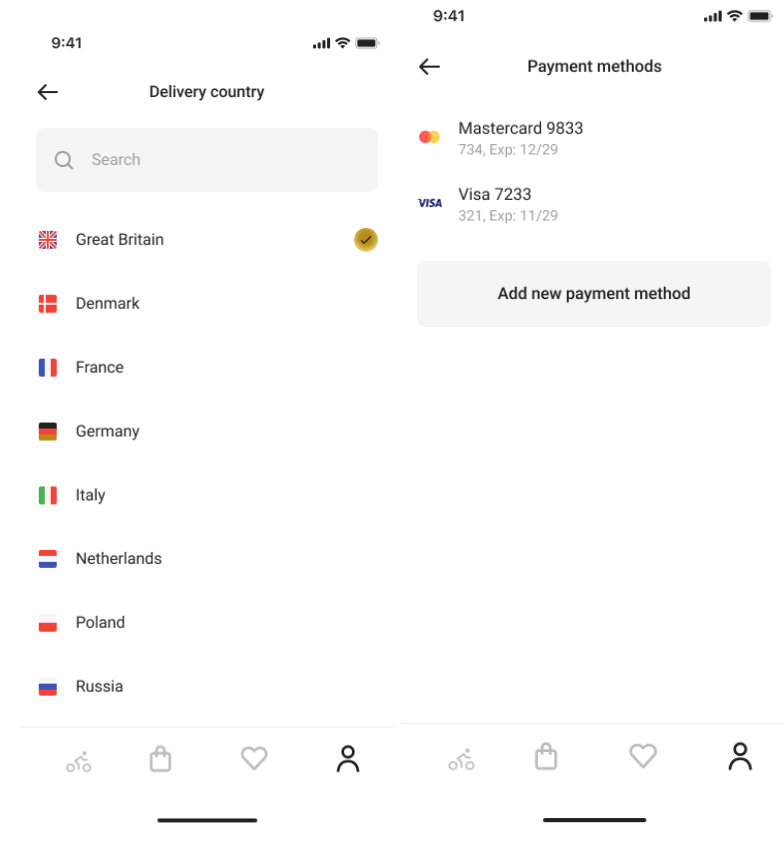
Efficient Checkout System

BykX

BykX is an innovative e-commerce platform dedicated to revolutionizing the online bike shopping experience. It aims to provide users with a streamlined, user-friendly, and hassle-free process for browsing, selecting, and purchasing bicycles. BykX’s mission is to minimize cart abandonment and ensure that users have a positive and efficient shopping experience, with a particular focus on addressing challenges related to cart abandonment, especially at the registration page. Through transparent and user-centric design, BykX seeks to empower customers to make well-informed decisions when choosing their ideal bike.

RolesĀ 

My role in this project for bike e-stores encompassed the end-to-end project, from user research to high-fidelity design.
  • Interaction (IxD) Designer
  • User Experience (UX) Designer
  • User Interface (UI) Designer

Deliverables

Interaction Design: High-fidelity interactive prototype for key tasks on iOS
UX/UI Design:
  • Secondary Research
  • User surveys and one-on-one interviews
  • User personas
  • Task flows
  • Journey maps
  • Competitor Analysis
  • Site maps
  • Low fidelity wireframes and prototype
  • High-fidelity prototype
  • Usability tests and findings
Project Specifications
Duration: 4 weeks
Tools:
  • Figma
  • Mavel
  • Maze
  • Miro
  • Canva
  • Photoshop
  • Illustrator

Proposed Features

  1. Streamlined Guest Checkout: Simplify the checkout process by offering a guest checkout option that allows users to make purchases without the need for account creation. This reduces friction and accelerates the checkout process.
  2. Clear and Concise Product Information: Ensure that product details, including features, specifications, and pricing, are presented clearly and concisely. This enables users to make informed decisions swiftly without the need for extensive research.
  3. Responsive Support: Provide accessible customer support options during the checkout process, such as live chat or a helpline, to assist users in real-time with any questions or concerns they may have.

Approaches

I began with in-depth user research to understand cart abandonment reasons. This research informed parallel work-streams, expediting feature development for a simplified checkout. Each feature aimed to enhance user satisfaction and differentiate our platform. Despite constraints, I leveraged existing infrastructure, ensuring efficient integration into our platform and completing the project within the specified timeframe.

User Research

My research included competitive analysis to better understand the checkout system and the flows of e-commerce sites. User surveys helped me identify the right variables for selecting, buying and their deciding making factors. Lastly, one-on-one interviews provided qualitative and emotional insight into key points of usersā€™ journeys.
Research Paper
  • Primary Cart Abandonment Factors:Ā Based on secondary research, the biggest factor contributing to cart abandonment is extra costs (shipping, tax, fees), with 53% of 4263 respondents citing this as the leading cause of abandonment during checkouts.
  • Account Creation Hurdle:Ā The second most significant factor identified in the research is the requirement to create an account before purchase, which was mentioned by 31% of respondents. This hurdle can deter impulsive buyers seeking instant gratification.
Consumer Insights from Quora
  • Online bike buyers prioritize reviews, assembly guidance, effective communication with sellers, expert support, and robust warranty policies as pivotal factors influencing their purchasing decisions.
Survey Findings
  • Pricing and Quality Concerns:Ā 62% of respondents express concerns about pricing and product quality when shopping online for bikes.
  • Material Quality:Ā 81% of respondents prioritize long-lasting bike materials as their primary requirement when considering a purchase.
  • Importance of Product Reviews:Ā 100% of respondents find product reviews to be a crucial factor in their decision-making process.

Streamlining the checkout process, ideally on a single page, is essential for effective design. Companies have reported over 40% growth increases by simplifying the checkout process.

Stripe and Shopify's one-click checkout, for example, has led to a 90% boost in conversion rates.

Understanding user empathy

The user journey for online bike buyers is guided by a series of user stories and influencing factors. It begins with users seeking easy access to product reviews for informed decision-making and progresses with concerns about potential delivery damage, a desire for parts transparency, and the need for assembly assurance. Towards the end of their journey, users prioritize warranty verification. Throughout this process, reviews, installation guides, communication with sellers, support services, and warranties all play significant roles in shaping user confidence and ultimately influencing purchasing decisions. Understanding and addressing these aspects is vital for creating a seamless and satisfying online bike buying experience.

Site Map and User Flow

These processes are driven by the synthesis of customer behaviors, intentions, desires, satisfaction levels, and fears, all derived from meticulous research. Understanding the user journey in an e-commerce environment enables the identification of pain points and opportunities for improved customer interaction and customer purchasing experiences. By mapping out these stages, a user flow is meticulously crafted to guide users through their journey, ensuring a seamless and satisfying experience. The resulting site map lays the foundation for a well-structured and user-centric e-commerce platform, addressing user needs and optimizing their interactions at every step of the way.

Design Principles

The heuristic design principles for competitor platforms center around essential usability aspects crucial for efficient usage. We will examine the design and concept comparisons, actions, and inspirations within the checkout processes of industry leaders such as TREKBIKE, TARGET, and AMAZON.

TREKBIKES

  • Guest Checkout Option: Saves user time, no lengthy sign-up/verification required.
  • Process Pagination: Provides users with clear stage tracking and progress visibility.
  • Aesthetic Minimalism: Product and checkout pages feature minimal text and illustrations, emphasizing white space for a clean, user-friendly design.

AMAZON

  • Dropdown Convenience: Enables easy navigation between titles.
  • Clear and Organized Layout: Foldable for quick access to other titles, with aligned subtitles for clarity.
  • Enhanced Order Confirmation: Additional order details now displayed on the add-to-cart panel.

TARGET

  • Compact Product Pages: Add to cart directly from product listings for time savings and clarity.
  • Efficient Sign-In/Sign-Up: Streamlined account creation during checkout.
  • Clear, Bold Icons: Enhance user understanding without the need for extensive text.
  • Smart Recommendations: Upselling and cross-selling with “Frequently Bought Together”.

Design Challenges

Out of many design challenges to create a better checkout system for online bike buyers, I found the following four challenges are important and should be carefully considered in the designing stage. Addressing these design challenges can lead to a smoother, more user-friendly, and more efficient checkout system for online bike buyers

Account Creation

Challenge: Balancing the need for user accounts with a desire for quick purchases.Ā 
Solution: Implement a guest checkout option while encouraging account creation for added benefits

User Assistance

Challenge: Providing assistance to users who may have questions or encounter issues during checkout.
Solution: Include clear tooltips, FAQs, and live chat support options.

Order Transparency

Challenge: Ensuring users have full visibility into their order details and costs.
Solution: Include an order summary page before finalizing the purchase for review.

Prototyping

Several rounds of rapid sketching on paper and using sketch appsĀ revealed the challenge of keeping key tasks simple, and at a single level. This exercise was important in discovering which existing design patterns within BykX made sense, and how users would navigate between screens.

Wireframe:

Styleguides (Branding, Typography and Color)

Company Name: BykX

Brand Personality:

BykX shows the persona of an expert in the field of biking, consistently staying abreast of the latest trends and top products related to cycling. X represents a premium model. The brand gives a sense of authority, knowledge, and passion for all things biking.BykX is a brand that represents expertise, savvy advice, unwavering focus, seriousness, and dependability in the realm of biking. We are your trusted partner on every cycling journey, always striving to provide the very best in biking knowledge and recommendations.

Icons and Buttons:

Color Choices:
Cinnamon yellowish brown and Navy Dark Blue
  • Primary Color: Cinnamon color is like masala color. I want to make the color palette unique and associated with a warm and earthy.
  • Secondary color: Navy Dark blue, to be associated with trustworthiness and professionalism. I want to show customers about the brand liability and quality.
  • The mix of both colors goes well as a classic and timeless theme. The color can help my brand be in a consistent and enduring image over time.
Ā 

Usability Testing

With feedback and usability testing data in hand, I adopted a user-centric approach. I put myself in the shoes of the bike store customers and prioritized their needs and preferences. These guided design changes and refinements helped to enhance userĀ satisfaction.

Impact Measurement

To measure the impact of these enhancements, metrics like conversion rates, cart abandonment rates, and customer satisfaction scores were important. I ensured that there was effectiveness on changes and they aligned with the goal of improving the shopping experience. However, to outperform industry leaders, research and design alone are insufficient. With additional time and resources, I could conduct in-depth research and extend usability testing, further improving my platform’s effectiveness.